HTML layout and fonts
A lot of web designers want an impossible thing: their pages to look exactly the same, to the last pixel, to every user, no matter which platform or browser is he using. In many cases they try to circumvent this by using ugly hacks and Flash.
The fonts are one of the biggest cause and the lack of their availability is huge. I just started to address this on all my websites using the Liberation fonts pack.
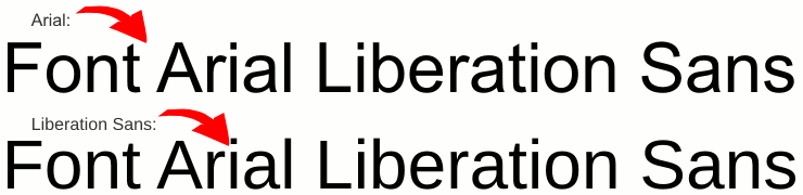
It is very simple and obvious: you don't have any guarantee about a certain font is installed on your target system, but you may get a guarantee of having a metric equivalent of it, and Liberation is exactly this: the metric equivalents of the Microsoft fonts, so you set one font as the primary one and its metric equivalent as the fall-back option.
As Linux is my primary target, this is what I do in CSS:
font-family: "Liberation Sans", Arial, sans-serif;Of course, is possible to do it the opposite way:
font-family: Arial, "Liberation Sans", sans-serif;
![]()


You're right, Liberation Sans has the same metrics as Arial, however it renders not-so-great at small sizes.
ReplyDeleteThis is why I prefer to choose from the Verdana-like metrics fonts, and only fall back to the Arial-like metrics. I have installed both Liberation Sans and DejaVu Sans on Windows, and DejaVu is definitely looking better at small sizes! (No ClearType though.)
So my font-family mixes two major metrics, with consideration to both Windows and Linux users: Verdana, DejaVu Sans, Bitstream Vera Sans, Nimbus Sans L, Liberation Sans, Helvetica, Arial, sans-serif;
Correct, the initial iteration of Liberation is not perfect, but a second version is expected, with better hinting.
ReplyDeleteYes, I cannot wait until the next release of Liberation Sans. While the metrics are not quite perfectly compatible, I find myself using DejaVu Sans (Condensed where available) since it's pretty close and looks great.
ReplyDeleteTo have the same metrics is just part of the problem.
ReplyDeleteThe original Microsoft fonts contain byte-codes that help a byte-code-interpreter-enabled renderer to draw text in small sizes that look better, almost perfect.
More references and screenshots:
http://avi.alkalay.net/2007/01/freetype-with-bytecode-interpreter.html
http://avi.alkalay.net/linux/docs/font-howto/Font.html#notgood
Sure avi, but I believe I said a second version of Liberation is expected to have better hinting.
ReplyDeleteAnd there is always the software patents problem, fonts will not look identical on Linux and Windows, hell, they don't look identical even on Mac and Windows, but to preserve the layout the same metrics are very useful.